The Science Behind Color Harmony is a multifaceted field that bridges psychology, aesthetics, and the physics of light to explain why certain color combinations are pleasing to the human eye. Understanding this science is essential for anyone seeking to create visually balanced environments, compelling designs, or a personal style that resonates with their natural features.
The Science Behind Color Harmony Explained
At its core, color harmony refers to the aesthetically pleasing arrangement of colors. This phenomenon is not arbitrary; it is governed by principles rooted in both human perception and scientific research. When colors are harmoniously combined, they evoke feelings of order, satisfaction, and visual comfort. The Science Behind Color Harmony incorporates theories from Isaac Newton’s color wheel to modern-day colorimetry, providing a robust framework for practical application.
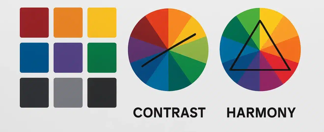
- Color Wheel Theory: The color wheel, developed in the 18th century, remains foundational for understanding relationships between colors, such as complementary, analogous, and triadic schemes.
- Color Temperature: Warm and cool colors impact mood and perception, influencing how spaces and designs are experienced.
- Simultaneous Contrast: Colors can appear different based on their context, an effect studied extensively in visual science.
Professionals in design, fashion, and branding consistently rely on these principles to achieve cohesive results that appeal to the human eye and psyche.
Color Psychology: The Emotional Influence of Hues
Color psychology examines how colors influence emotions, behaviors, and even physiological responses. The Science Behind Color Harmony is deeply intertwined with psychological effects, as harmonious palettes can evoke calmness, excitement, trust, or energy depending on their composition.
Key Psychological Associations
- Red: Often associated with passion, urgency, and vitality.
- Blue: Conveys calm, trust, and professionalism.
- Yellow: Linked to optimism and energy.
- Green: Suggests growth, balance, and tranquility.
- Purple: Represents luxury, creativity, and spirituality.
The strategic use of these colors in harmonious combinations can enhance brand recognition, influence purchasing decisions, and even affect productivity in workspaces.
Visual Balance: Achieving Aesthetic Equilibrium
Visual balance is a critical component of The Science Behind Color Harmony. It refers to the distribution of visual weight in a composition, ensuring that no single element overwhelms the others. Achieving balance involves more than just choosing the right colors; it requires thoughtful placement, proportion, and contrast.
Principles of Visual Balance
- Symmetry: Mirrored arrangements create a sense of stability and order.
- Asymmetry: Dynamic layouts can be balanced by distributing colors and forms to maintain harmony.
- Radial Balance: Elements radiate from a central point, often seen in mandalas and floral designs.
Color harmony supports visual balance by preventing clashing or jarring combinations, allowing the viewer’s eye to move comfortably across a design or ensemble.
Undertone Science: The Foundation of Personal Color Analysis
Undertone science is pivotal in personal color analysis and wardrobe creation. The Science Behind Color Harmony emphasizes that every individual has a unique skin undertone—cool, warm, or neutral—that determines which colors enhance their natural beauty.
Identifying Your Undertone
- Vein Test: Blue or purple veins suggest cool undertones, while greenish veins indicate warm undertones.
- Jewelry Test: Silver jewelry flatters cool undertones; gold complements warm undertones.
- Sun Reaction: Those who burn easily often have cool undertones, while those who tan may have warm undertones.
Understanding undertone science allows individuals to select clothing, makeup, and accessories that create harmonious and flattering combinations, enhancing confidence and personal style.
Integrating Color Harmony in Everyday Life
The Science Behind Color Harmony is not confined to professional design. It can be applied to daily choices in attire, home décor, and branding efforts. By leveraging psychological principles, visual balance, and undertone science, anyone can curate environments and appearances that foster well-being and positive impressions.
- Home Décor: Harmonious palettes can make spaces more inviting and functional.
- Personal Style: Wearing colors that match your undertone enhances appearance and self-assurance.
- Business Branding: Consistent color harmony strengthens brand identity and customer loyalty.
Ultimately, mastering The Science Behind Color Harmony empowers individuals to make informed, strategic decisions that impact perception and emotional response.
Conclusion: Harnessing the Power of Color Harmony
In summary, The Science Behind Color Harmony encompasses a rich intersection of psychology, visual art, and scientific analysis. By understanding and applying principles from color psychology, visual balance, and undertone science, individuals and professionals can create environments, designs, and styles that are not only visually appealing but also emotionally resonant. Color harmony is both an art and a science, offering practical benefits that extend from personal appearance to professional success.
If you want to discover your ideal color palette and truly transform your appearance with professional guidance, start now: www.vanessabento.com.br